Grow-Mate Labels
Brief: Redesign labels for organic products to align with product repositioning and improve consistency across global markets.
Work carried out
Visual identity
Art direction
Label redesign
Mockups
Growmate offers organic solutions for soil, roots, and overall plant health—designed for gardeners and growers who want to grow better, naturally.
Previous Label Design

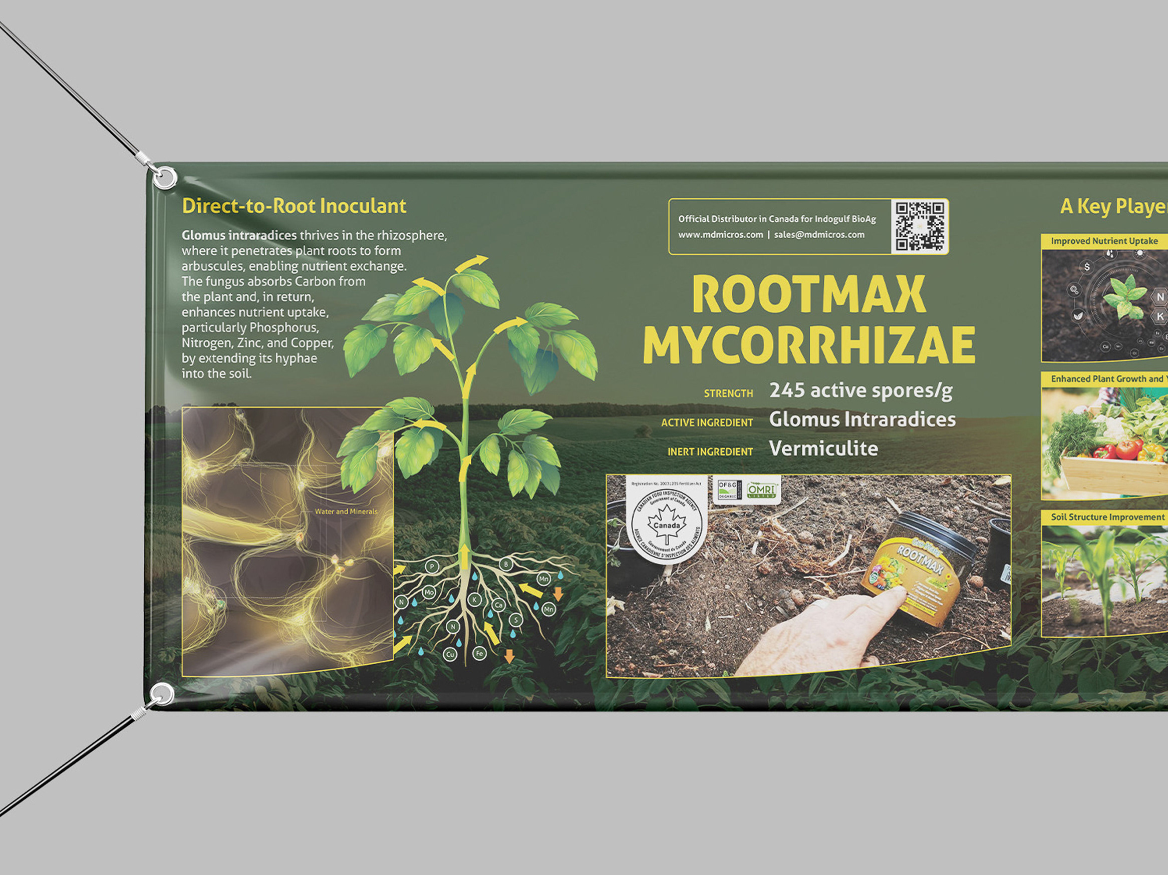
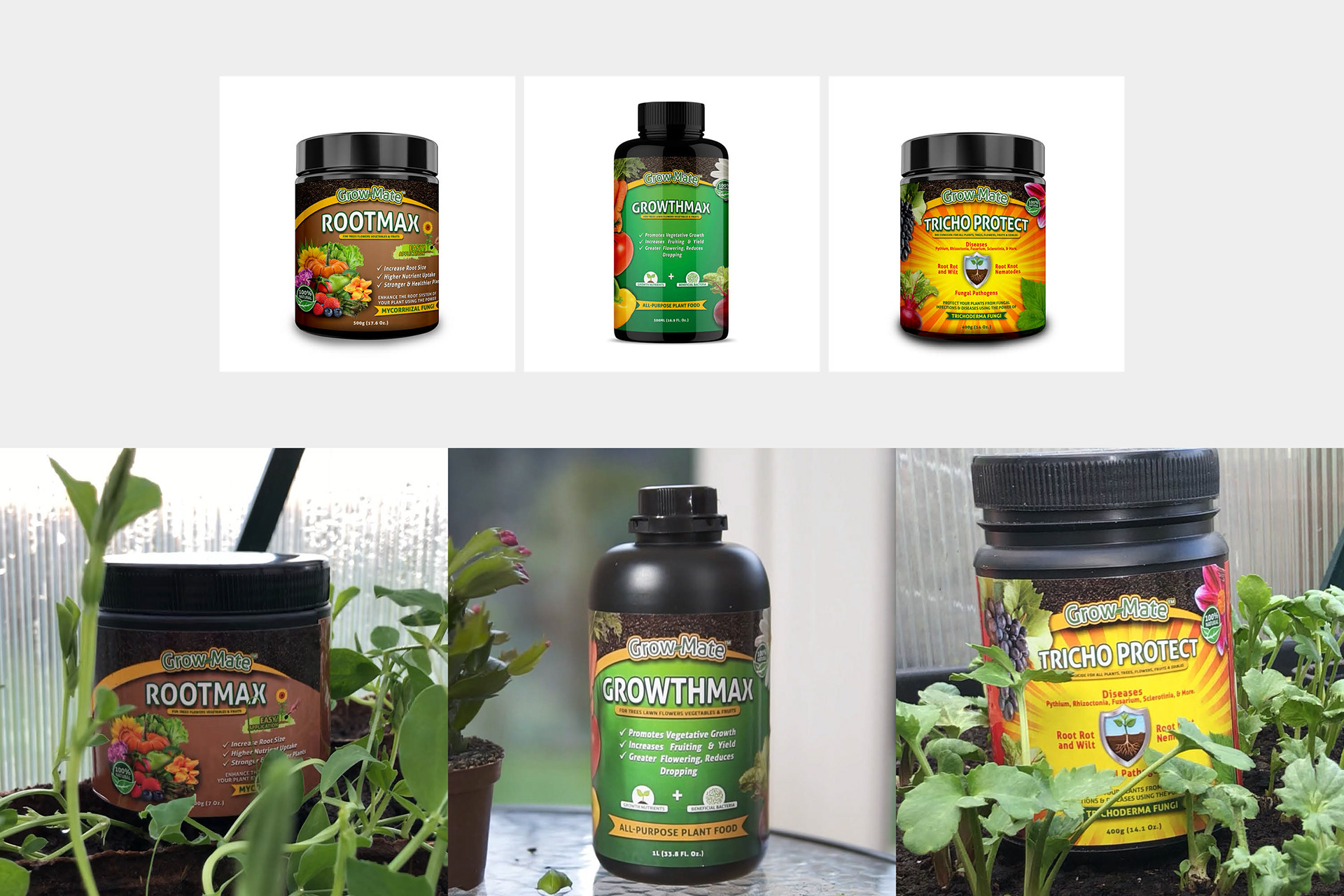
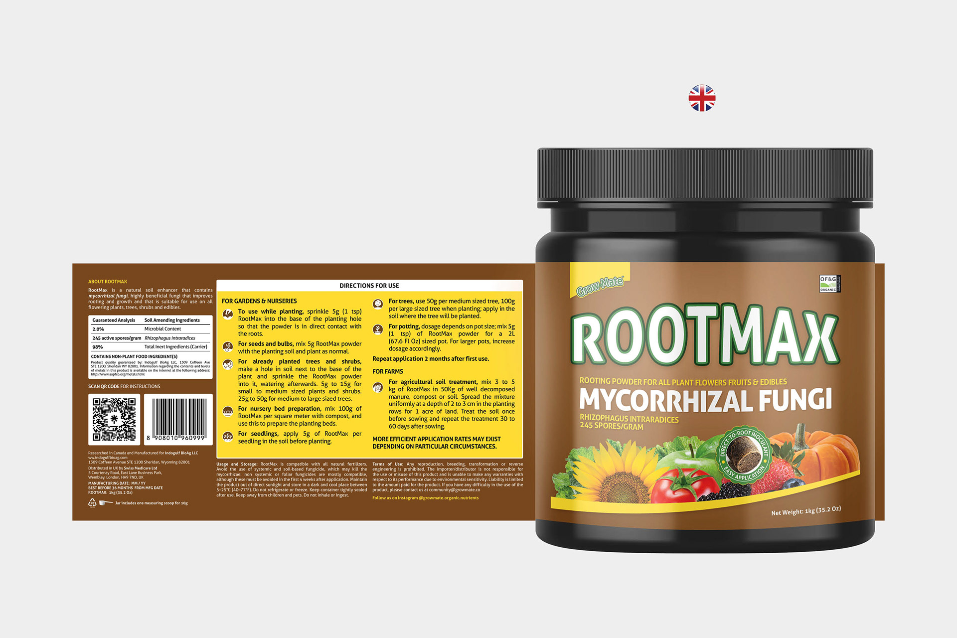
RootMax
I redesigned the label for RootMax, starting with the Canada version, which had the most requirements due to bilingual regulations. To manage space, I added a side panel for regulatory content and removed unnecessary graphics—keeping only the key elements: required copy, vegetables, and certifications.
The original RootMax logotype and color palette had to stay, but I brightened the yellow slightly for better contrast. I added a shape behind the logo to help it sit better in the layout, and a bold yellow shape in front of the imagery to bring structure and brand consistency.
Certifications were placed at the top right to make them easy to spot, especially for online shoppers. On the back, I highlighted dosage info in a yellow box and replaced line icons with filled ones for better legibility on smaller formats.
The US and UK versions were straightforward. For Germany, I adjusted spacing and layout to handle longer translations. This label system later became the base for GrowthMax and Tricho, keeping the brand unified across regions and packaging types.


GrowthMax
GrowthMax was repositioned as an indoor gardening product and reformulated into a powder, so I redesigned everything except the logos. To reflect this shift, I replaced the old imagery with commonly grown indoor plants like succulents and decorative greens.
Since the label has a green background, I carefully chose plants in red, yellow, and light colors to create contrast and help the visuals stand out. Two badges were included to highlight key product benefits, reminding users that GrowthMax contains all essential nutrients.
Once the UK label was approved, I adapted it for the US and German markets. The layout stayed consistent, with only small adjustments to the front and back.


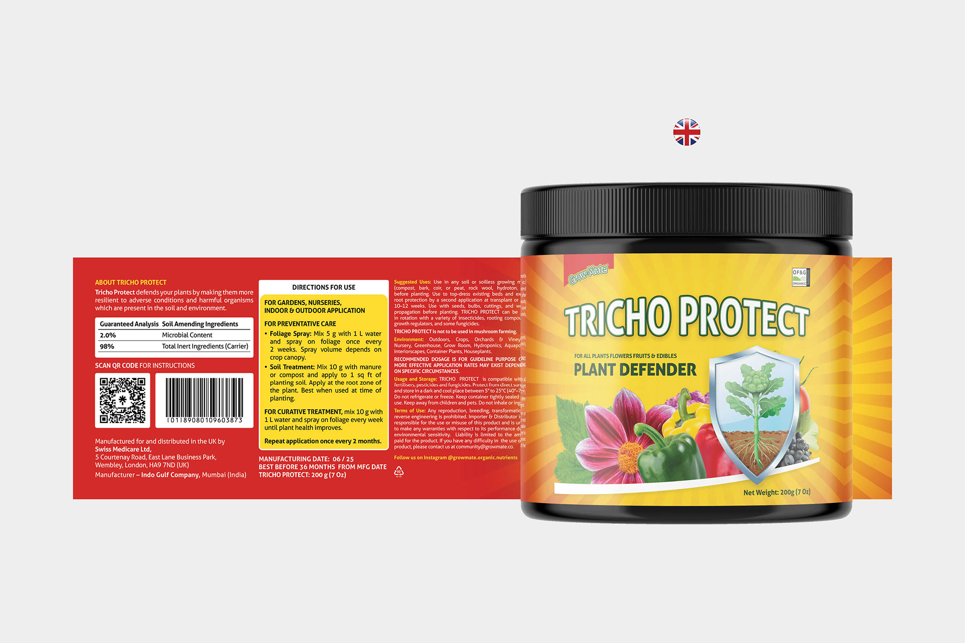
Tricho Protect
Tricho was repositioned as a fungicide, but due to regulations, we couldn’t mention anything related to foliar or soil diseases. I removed all previous elements except the vegetables and logos, and updated the sunrays for a cleaner, refreshed look.
To communicate plant protection visually, I introduced a silver shield, symbolizing strength and reliability. Since the usual yellow shape didn’t work well with the red background, I replaced it with white for better contrast and balance.

Result
With the new labels, Growmate is better positioned to compete on Amazon. The visuals are cleaner, more targeted, and aligned with each product’s purpose, making the overall brand feel more authentic.

Explore More Projects