Universal Microbes
Brief: Create a logo, website, Amazon listing assets, and print materials for a biotech company focused on microbial solutions.
Work carried out
Visual identity
Art direction
Content strategy
Logo design
Website
Amazon EBC
Amazon storefront
Amazon listing images
Label design
Business card

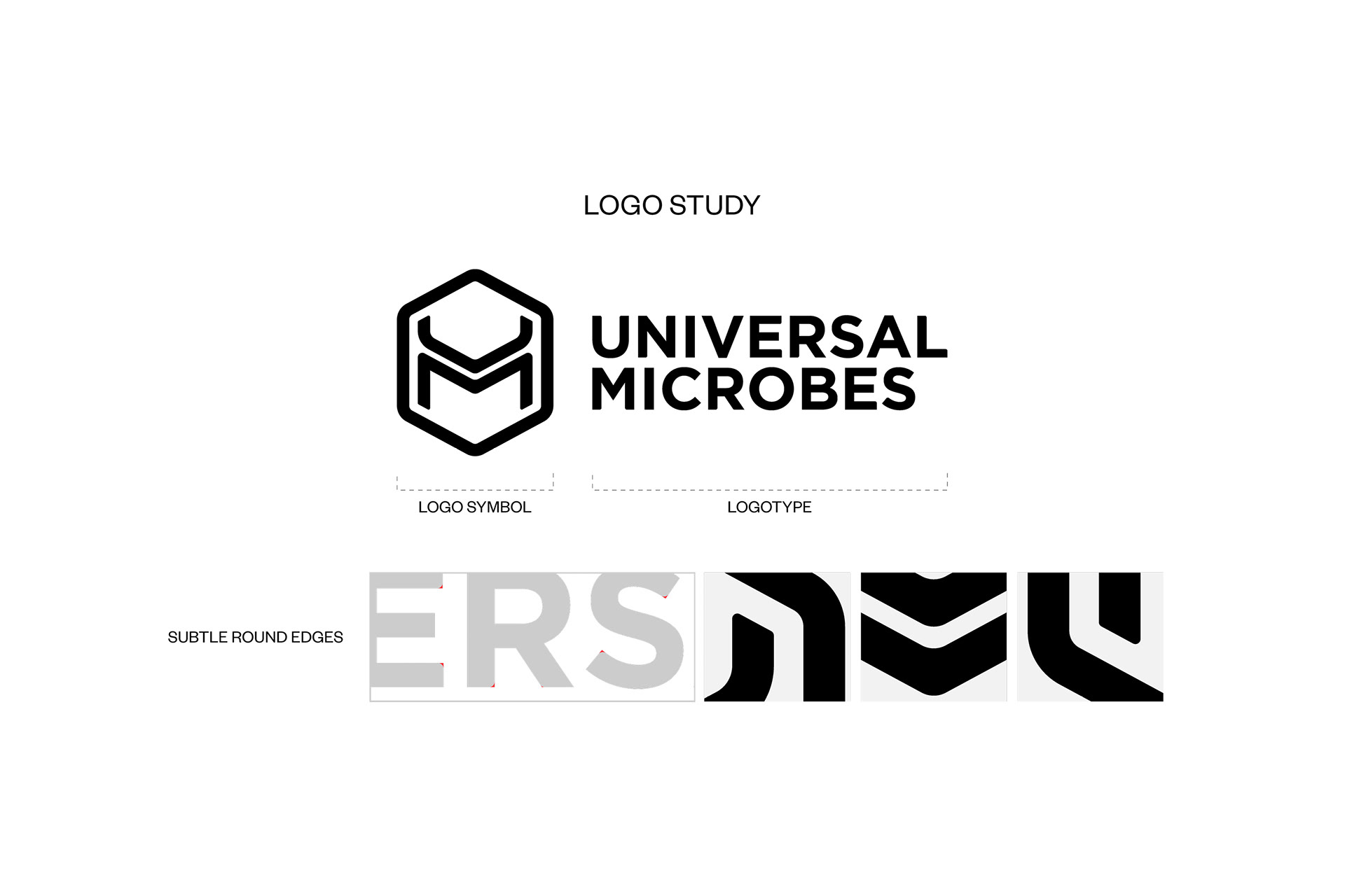
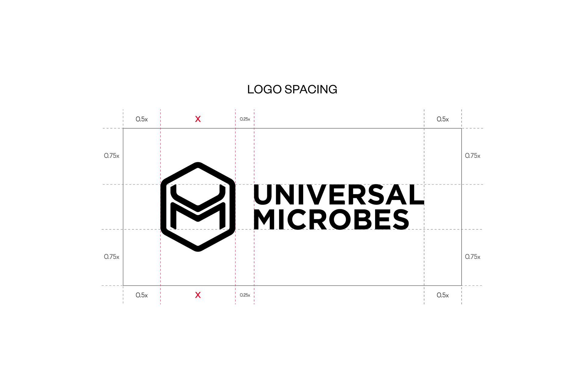
Logo
Universal Microbes is a biotech company focused on microbial solutions. I designed a full visual identity that reflects the scientific nature of the brand, starting with the logo inspired by a hexagon, commonly found in scientific and molecular structures. The “UM” initials are stacked to subtly represent the sun and earth, aligning with the brand’s agricultural roots. The logo comes in two orientations: a primary horizontal version and a secondary vertical version for smaller formats. The original brand colors were blue and green, but the client later decided to go with black and reverse versions across all materials for a cleaner approach. We chose Gotham for its clean, modern structure, fitting for a new scientific brand.

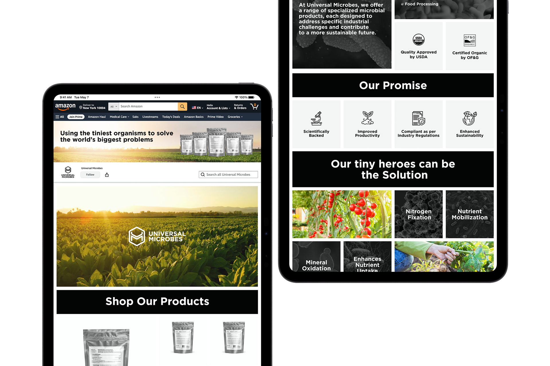
Website
I also designed and built the brand’s website on Wix. Since Wix is adaptive rather than fully responsive, I used two-column strips with manual padding to keep layouts consistent across devices and make better use of space. This setup allowed me to place a photo on one side and text on the other, unlike the standard section that allows content only in the center.

I regularly tested layouts on tablet and mobile to make sure nothing was pushed, overlapping, or misaligned, so users could navigate the site smoothly

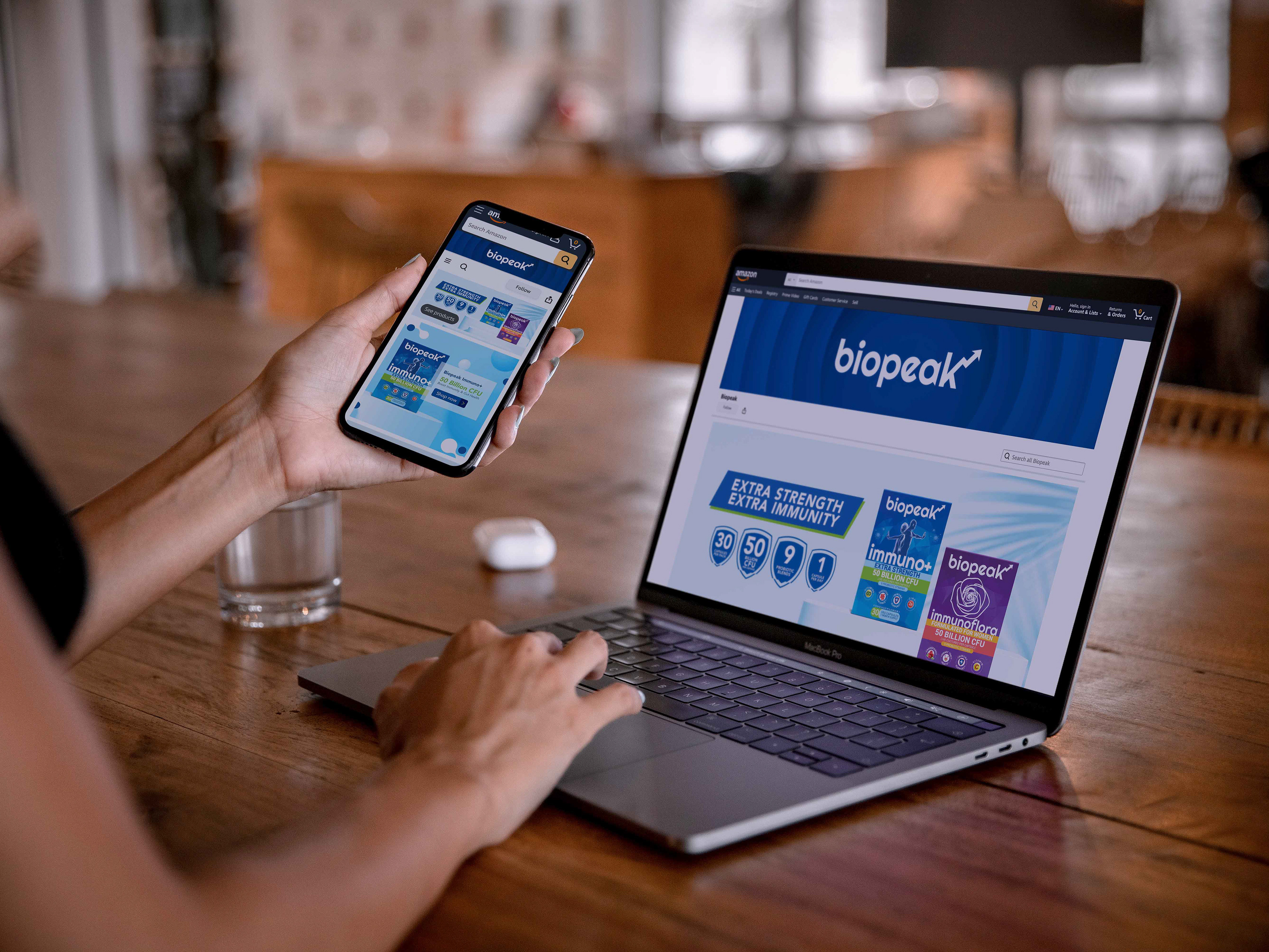
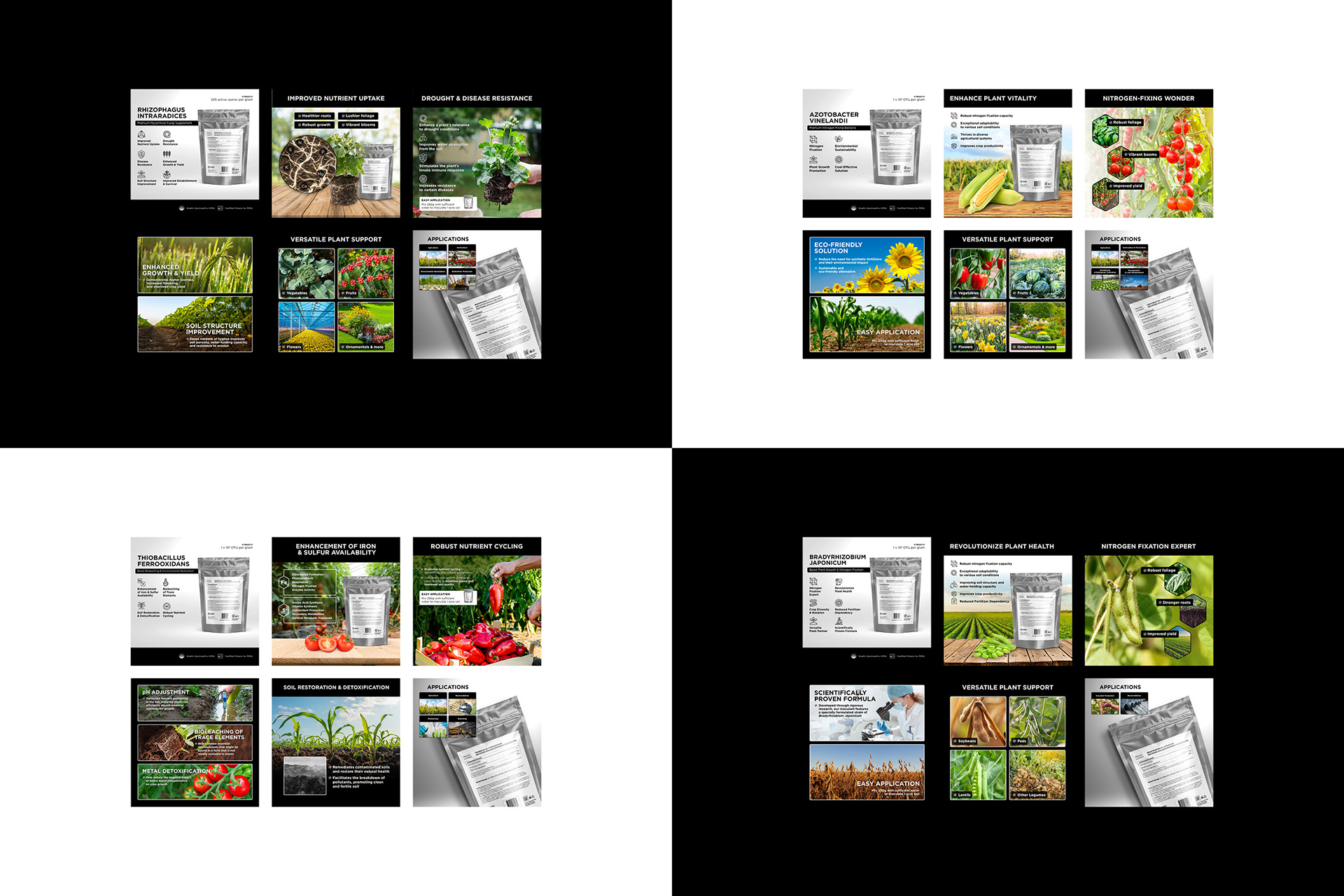
Amazon Assets
Universal Microbes targets B2B and large-scale farmers, so I kept the imagery grounded in agriculture and biotech.
Alongside the website, I developed the Amazon assets. With six images per listing, I focused on selected photos that felt authentic. The goal was to create trust and communicate product value quickly.
Universal Microbes is now a brand with a clear identity, built to connect with farmers and traders in the agricultural space.
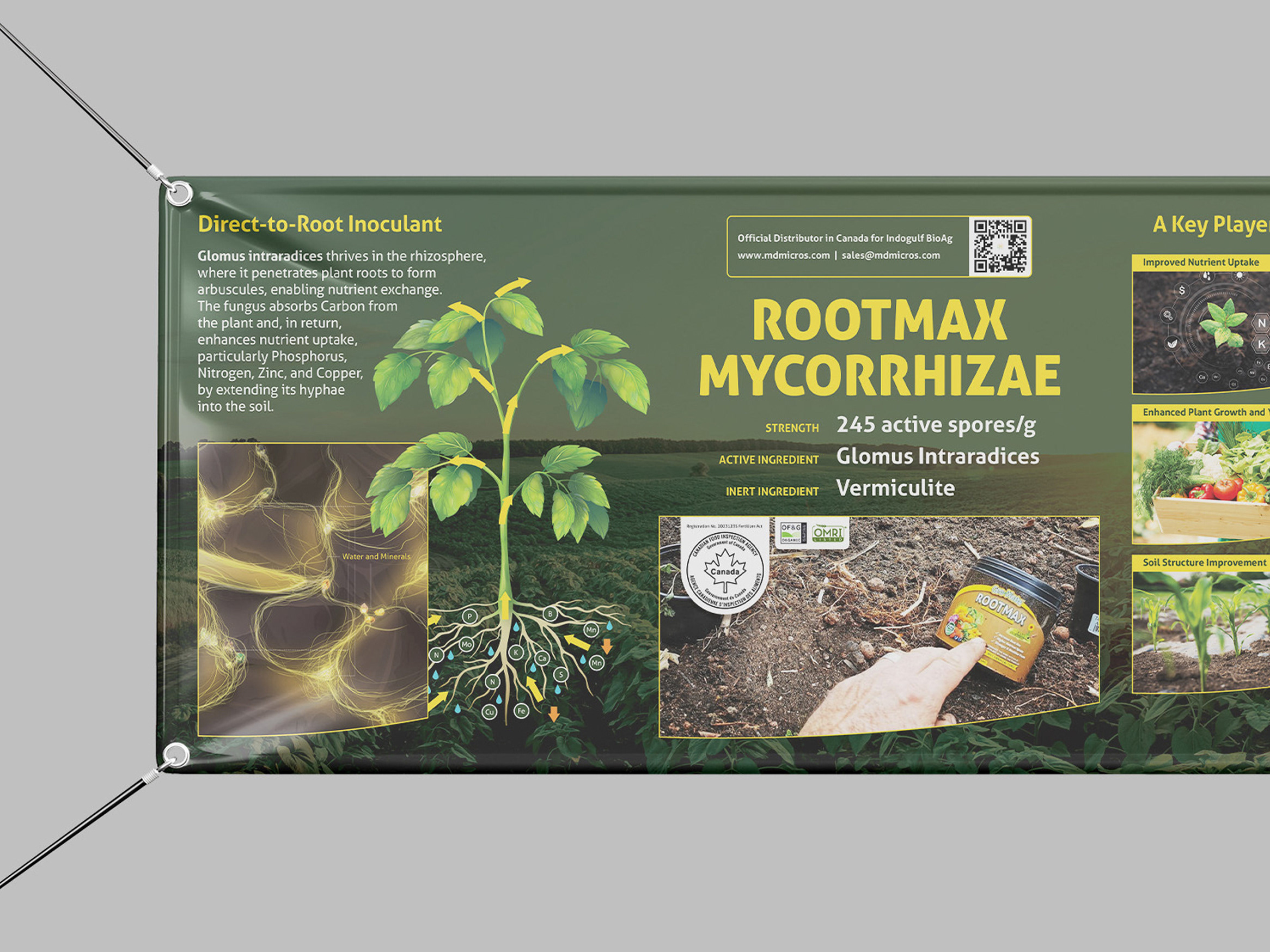
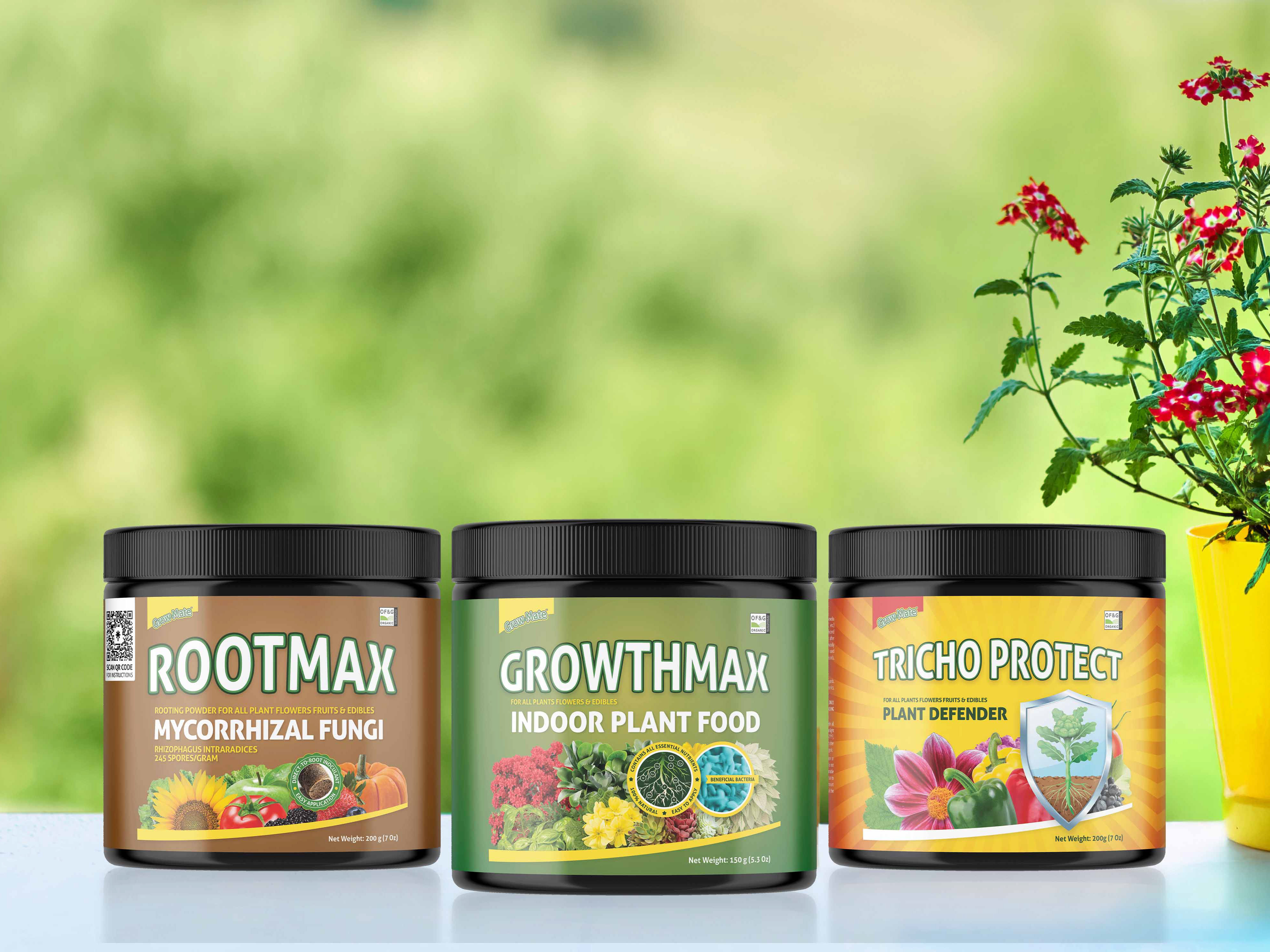
Labels
The product labels have gone through several revisions, and we’ve recently finalized two versions: one for Canada (with bilingual content) and one for the US. For now, the packaging will be a pouch with a single-sided label, which required careful layout planning due to space limitations